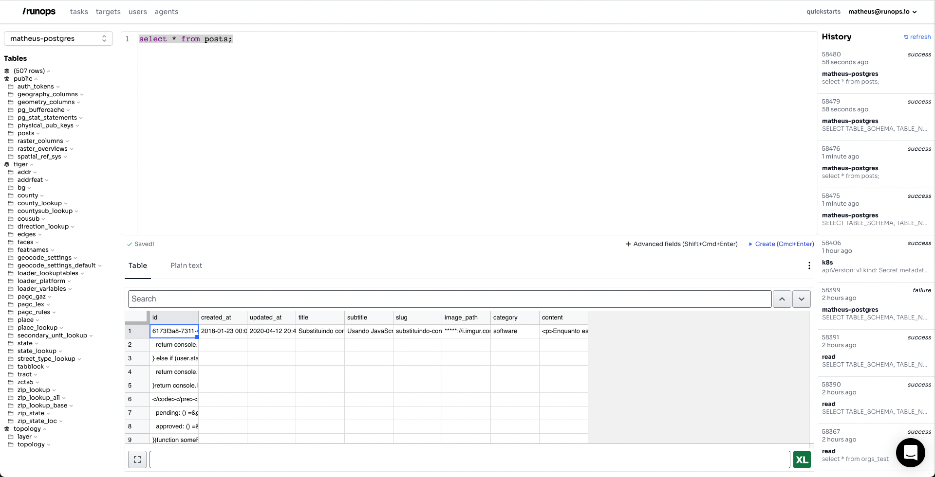
We got some updates on the new task page for y'all!
- We did some design updates and added some features to the new task page. So buckle up because it's the first step to improving a lot more stuff in there:
- We added a fancy pants Combobox component to the application, so you can search for all your targets and make your workflow smoother while switching and selecting targets 🕺
- Proportion and use of space were adjusted in a way you can better visualize the logs of your tasks. We managed to decrease just a little of space from the editor but make a substantial increase of space in the logs, using the same total area 👀
- Selecting a target was placed on top of where the schema for your MySQL and Postgres database is loaded to improve the organization in the page 📄
- For every target you select, we change the URL so you can save that link and always have direct access to the targets you work with the most 🔗
Next steps
- We still want to improve the use of space in the logs area, so some new design updates are coming on the tab component and in the actions of that page;
- We aim to make this page very close to an IDE (Integrated Development Environment), so many more exciting features and improvements are under development or discussion.
Stay tuned 📻


